Statistics & Graphics: Graphics Tools
Scatter Diagrams
- Line styles
- Specify ranges on axes
- Titles and labels
- Include linear regression line
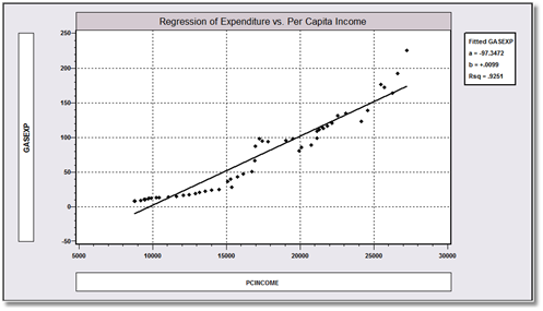
This is a plot of gasoline expenditure against per capita income for the U.S. economy from 1953 - 2004, with the linear regression plotted with the scatter
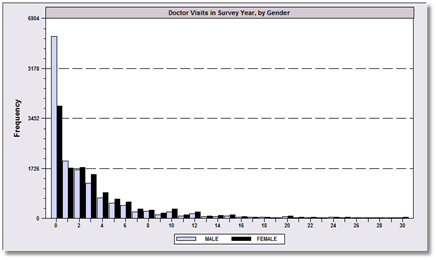
Histograms
- Discrete or continuous data
- Specify bins, proportions or intervals
- Stratify by group
- Multiple simultaneous histograms
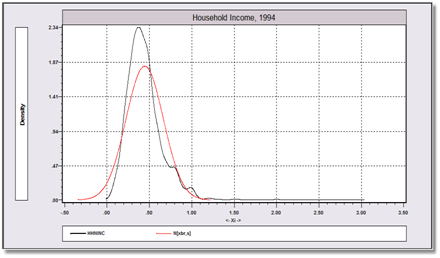
Graphical Displays
- Kernel density plot
- Matrix of scatter plots
- Line plots for time series
- Multiple time series plots
- Box and whisker plots
- Residual plots (against observation, time or other variables)
- User specified function plots
- Plot predictions from time series models
- Normal quantile plots
- Survival and hazard function plots
- Bubble plots
- ROC curve for binary choice models